Mobile UI Design
A selection of mobile interface designs across campaign, ecommerce, and charity projects. Each screen demonstrates my approach to accessible, responsive design with a focus on clarity, visual consistency, and component-based thinking.
Hütte
Hütte is a digital travel platform designed to help users find and book beautiful alpine stays with ease and inspiration.
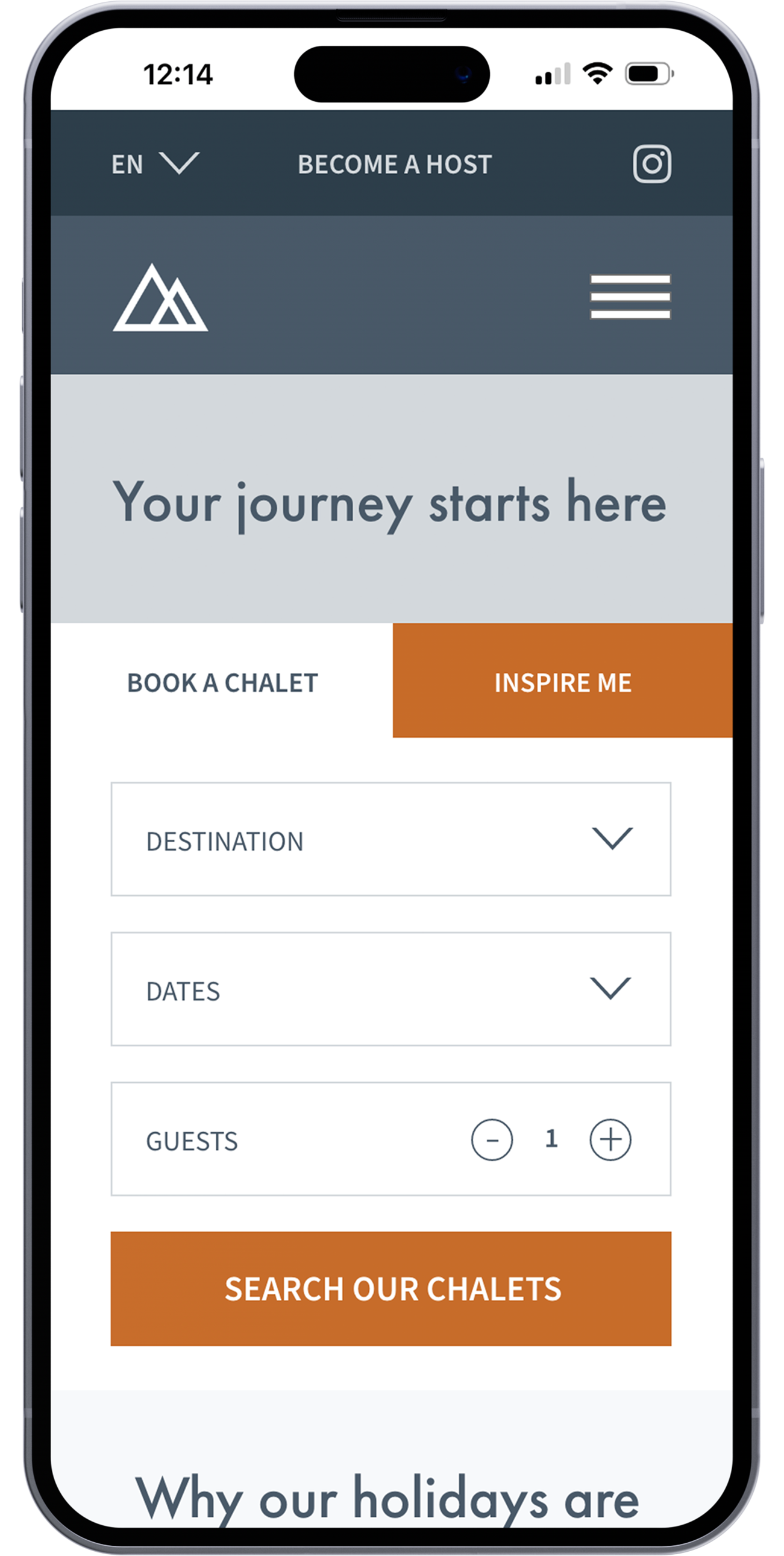
Homepage
A warm, welcoming entry point where users begin their journey — with simple search inputs and an “Inspire Me” option for flexible planning.
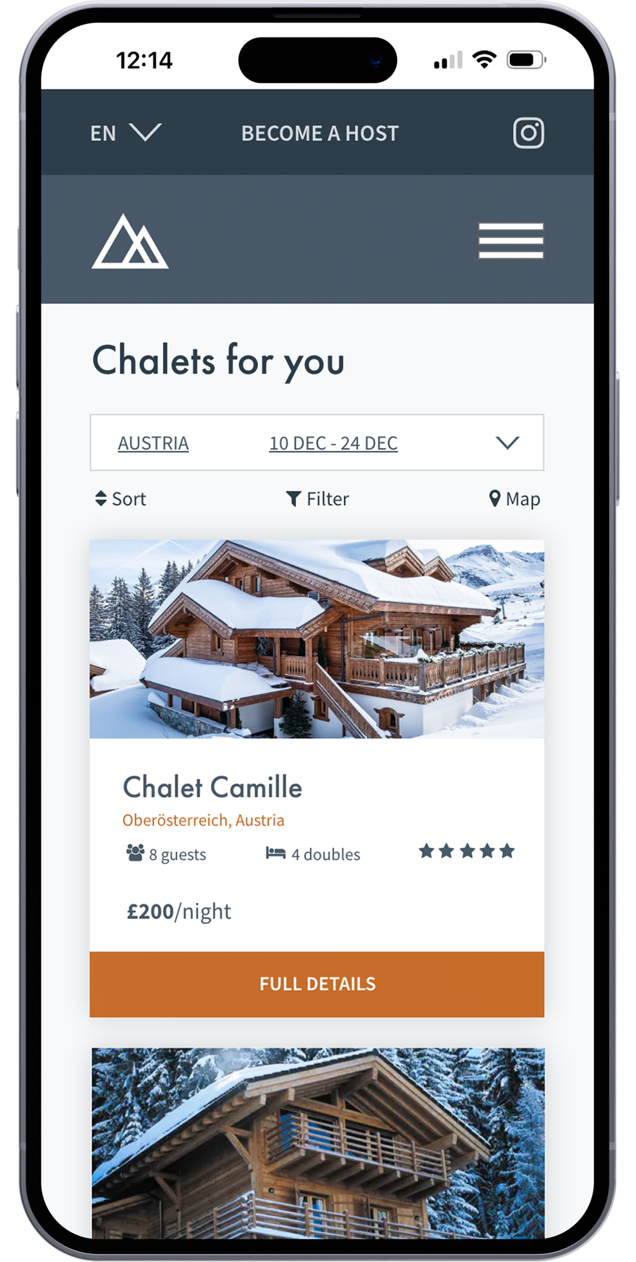
Chalet list page
Filtered results displayed clearly and accessibly, helping users browse available chalets that match their destination and dates.
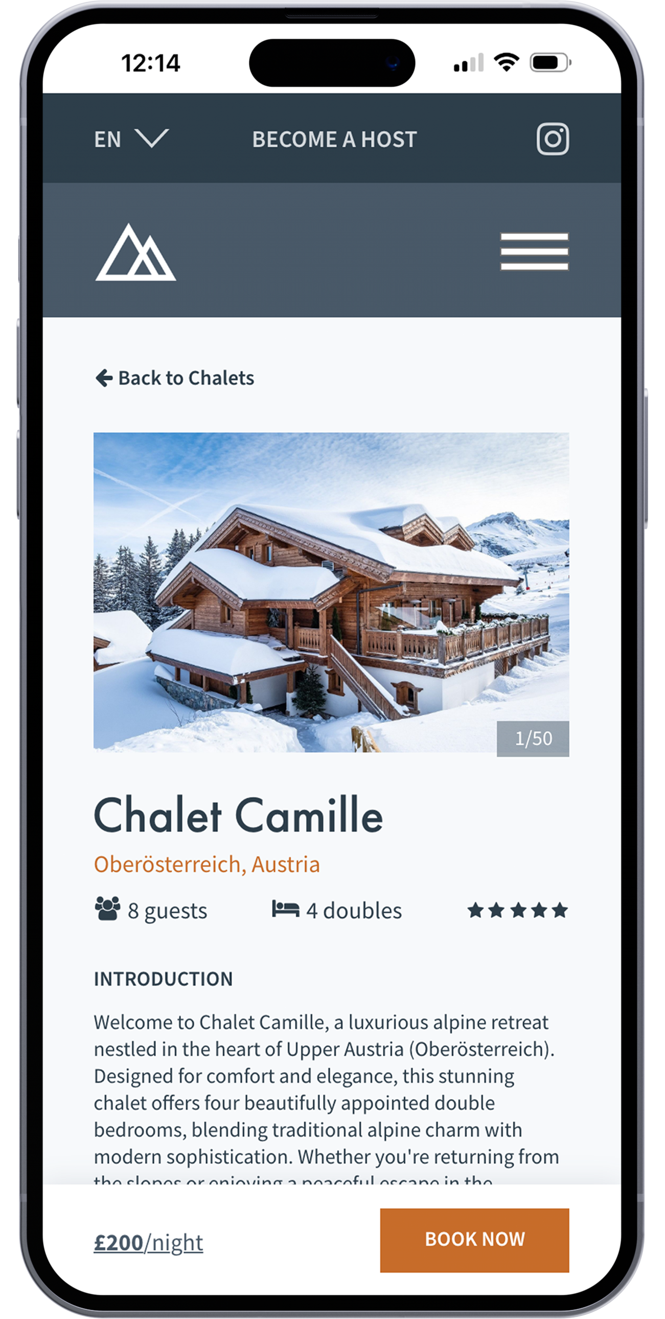
Chalet detail page
Detailed chalet information and a mobile-friendly booking section guide users smoothly toward making a reservation.
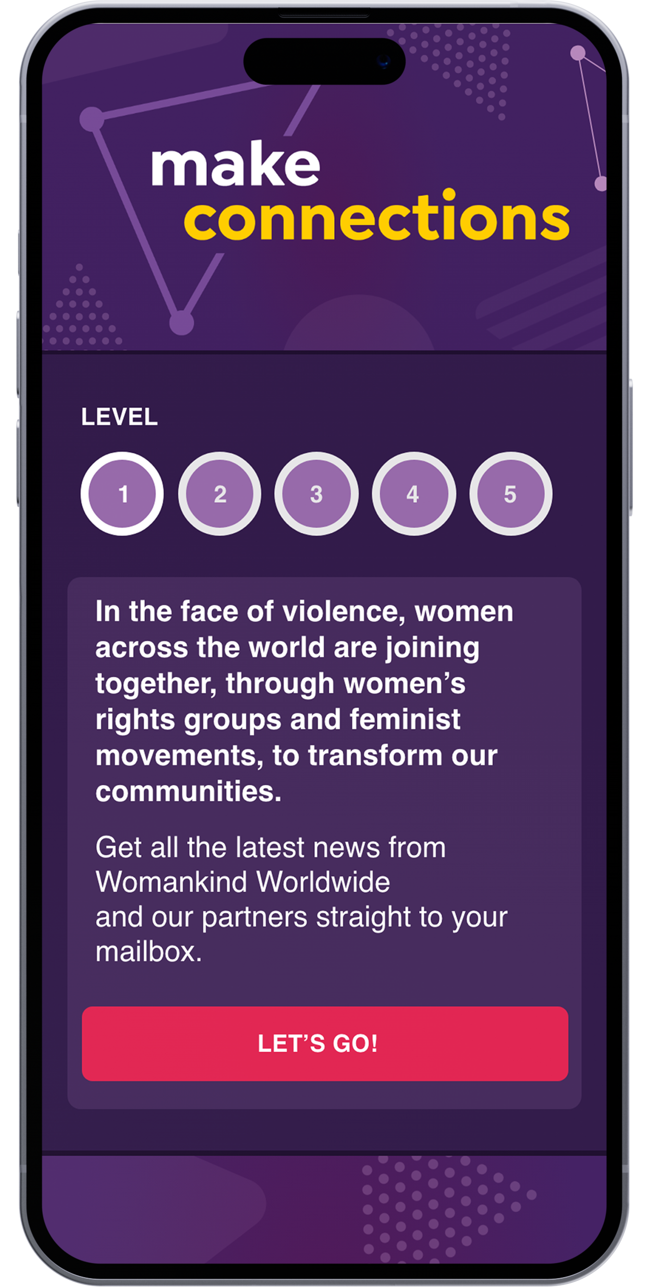
Womankind Worldwide Dot to Dot Game
An interactive mobile game and UI system designed to raise awareness of violence against women and girls through storytelling, activism, and discovery.

Pattern Library – Buttons
A modular button system including primary, secondary, game navigation, and dot buttons with all interaction states.

Pattern Library – Progress Indicators
Game progress and bonus level indicators with visual states for inactive, active, completed, and full-game completion.

Game Landing Page
Landing screen introducing the game, featuring a bold headline and primary CTA to begin
Welcome Screen
Welcome message with game progress tracker in its inactive state and a clear call to action to start.

Gameplay – Dot to Dot (Start)
First game level showing the dark background and interactive dot grid ready for the user to begin connecting.
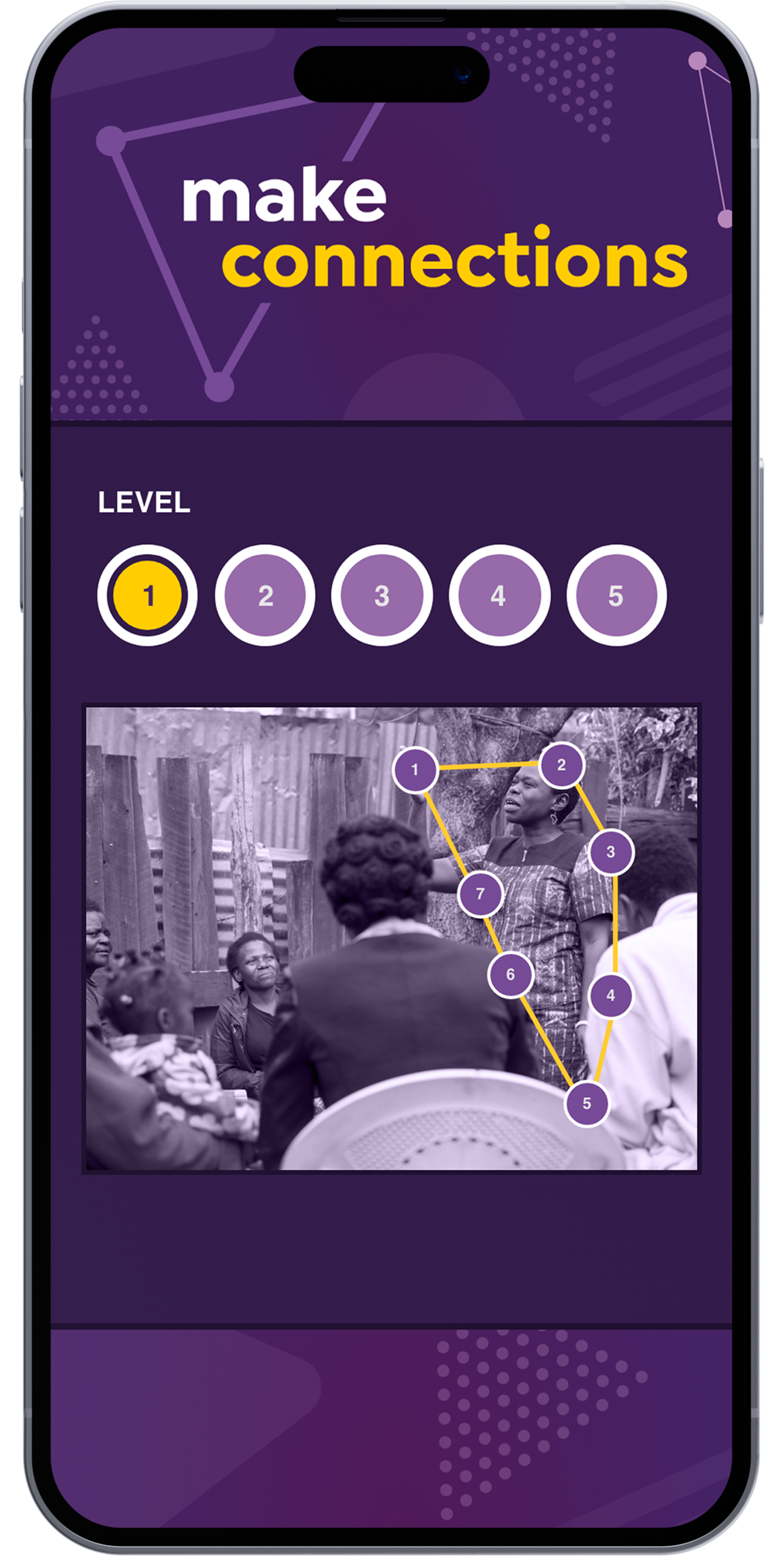
Gameplay – Transition (Image Reveal)
Mid-transition state as the user completes the level — an image gradually becomes visible behind the connected dots.
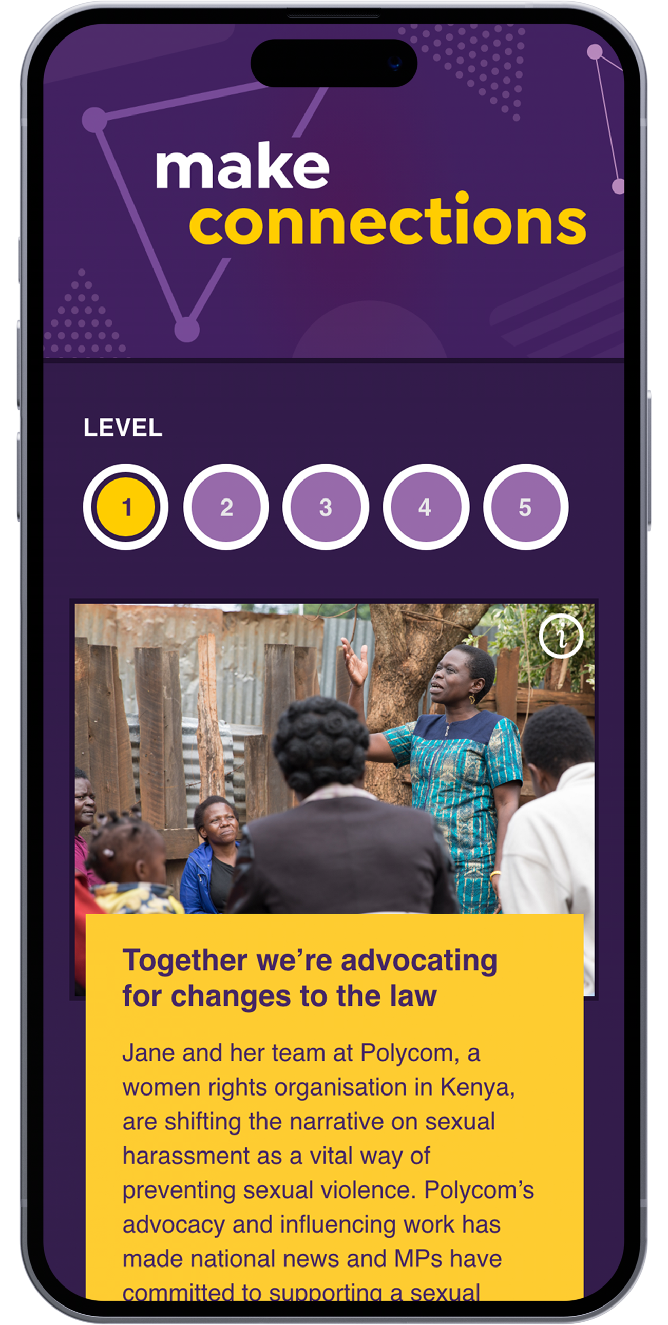
Gameplay – Full Image with Info
Completed level showing the full-colour revealed image with overlaid information about the featured person.

Game Complete Screen
Final screen congratulating the user, revealing the bonus level, and offering shareable downloads and social actions.
Louise Thomas Skin Care
A calm, contemporary UI for an independent skincare brand, balancing e-commerce and editorial content.

Homepage
Mobile-first homepage design balancing visuals and storytelling with intuitive product pathways.

Menu
Streamlined mobile menu with easy access to product categories, search, and account features — designed for clarity and quick navigation.

Product page
Product detail layout highlighting key information hierarchy, clean add-to-cart interactions, and accessible type for comfortable mobile shopping
Care Rights UK
A warm, accessible mobile site design for a rights-based organisation supporting older people and carers.

Homepage
Clear visual hierarchy and large, accessible typography ensure easy readability for all users, including older adults and carers accessing the site via mobile.

Menu
A simple, uncluttered menu makes it easy to navigate key support areas, even on smaller screens.

Content page
Responsive content layouts with strong contrast, generous spacing, and a clear typographic rhythm support long-form reading on mobile.
Made North
Mobile-first UI for an organisation creating innovative software solutions, designed to improve clarity, storytelling, and calls to action.

Homepage
Mobile-first homepage designed to convey purpose, professionalism, and warmth — with clear content hierarchy and an emphasis on accessibility.

Services with CTAs
Modular support section showcasing services and calls to action, structured for quick scanning and intuitive navigation.

Case study section
Clean, readable case study section layout optimised for mobile — with visual pacing and structured text to support storytelling on the go.