Threefold
Threefold do amazing work. They create highly innovative digital solutions for the publishing world, employing some of the best and brightest minds in the tech and digital industries.
My work
Brand creation including digital design guidance.
Visual Brand includes
Logo and logomark
Brand guidelines
Graphic devices
Colour
Typography
Imagery
Stationery
Verbal Brand includes
Tone of voice
Copy guidance
The challenge
Threefold needed to discover a clear brand vision and strategy in order to move forward into the future.
Threefold are part of the hugely successful Agora Inc publishing company based in the USA. They create highly innovative digital solutions for the different publishing houses under the Agora umbrella.
Threefold’s work is highly skilled and they hire some of the best and brightest minds in the tech and digital industries. They are an innovative, fun, and a game-changing company to work for. They create disruptive solutions that positively impact their clients organisations.
Having been founded in 2016 they had grown rapidly over the next few years but this fast growth meant that after a few years they needed to bring clarity to their brand strategy and visual identity. At that time they only had a logo and an outdated website. No brand vision or strategy. They wanted to bring cohesion to clients and employees alike and create a clear path as they moved forward into the future.
My work
An in-depth brand workshop with 10 key members of staff got the ball rolling.
These attendees included stakeholders, managers, senior and junior members of staff, and new employees. This cross section of employees was important to allow us to fully explore Threefold as an organisation from all view points.
During the workshop we undertook a number of exercises that helped us to streamline their features and benefits, identify their communication objectives, identify Threefold’s competitors and analyse their performance, analyse and understand their market focus, understand their current and retrospective brand challenges, and define their brand values, brand story, and crucially their brand personality.
At the end of the workshop Threefold had a clear vision of their values, mission, brand tone of voice, brand narrative, and their differentiation within the market.
This workshop together with further research and the design process led to the creation of a brand that exudes creativity, warmth and fun, all characteristics at the heart of the organisation. They are mentors and educators to their clients but they also give their employees the space to be playful and experimental. These were the guiding principals when creating their visual identity.
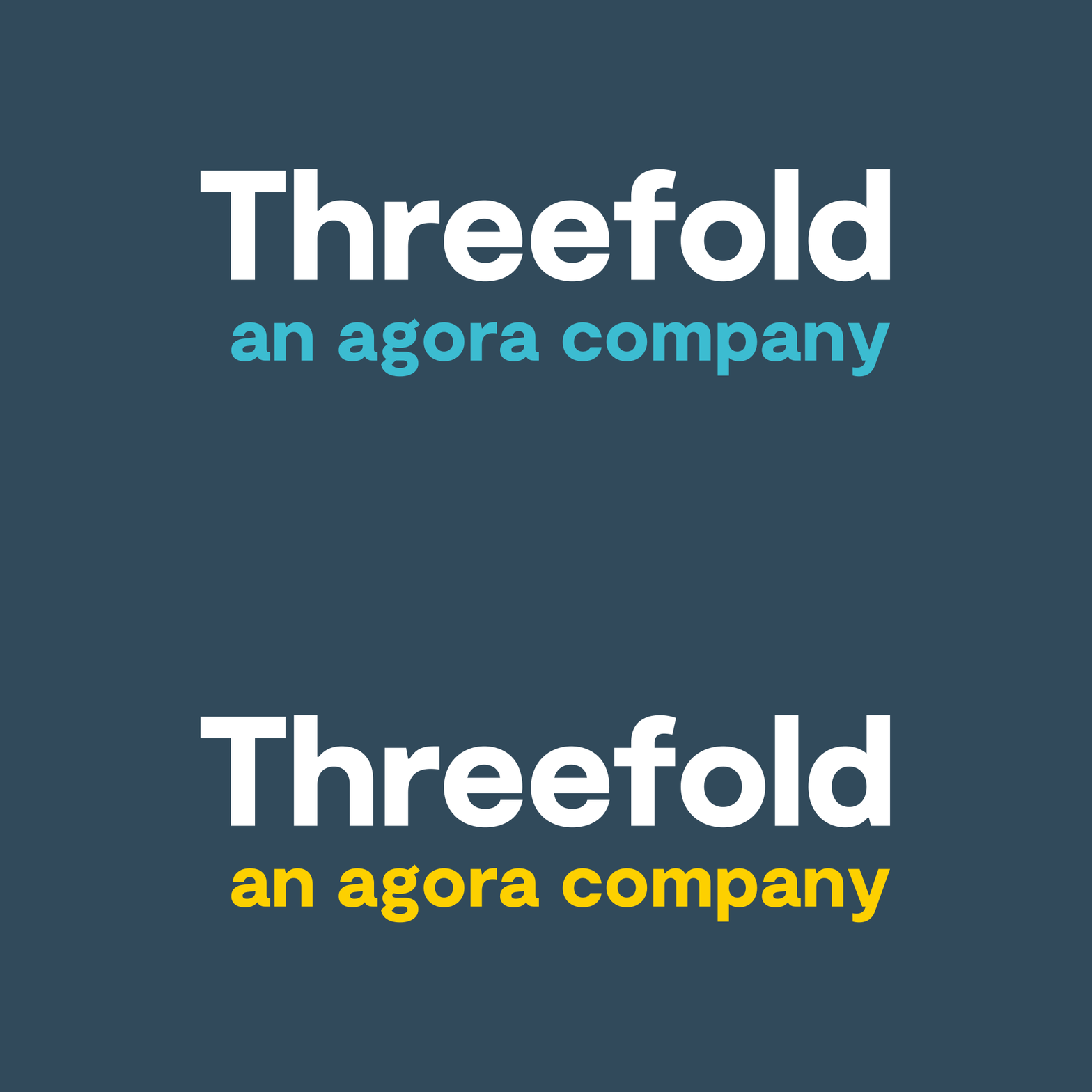
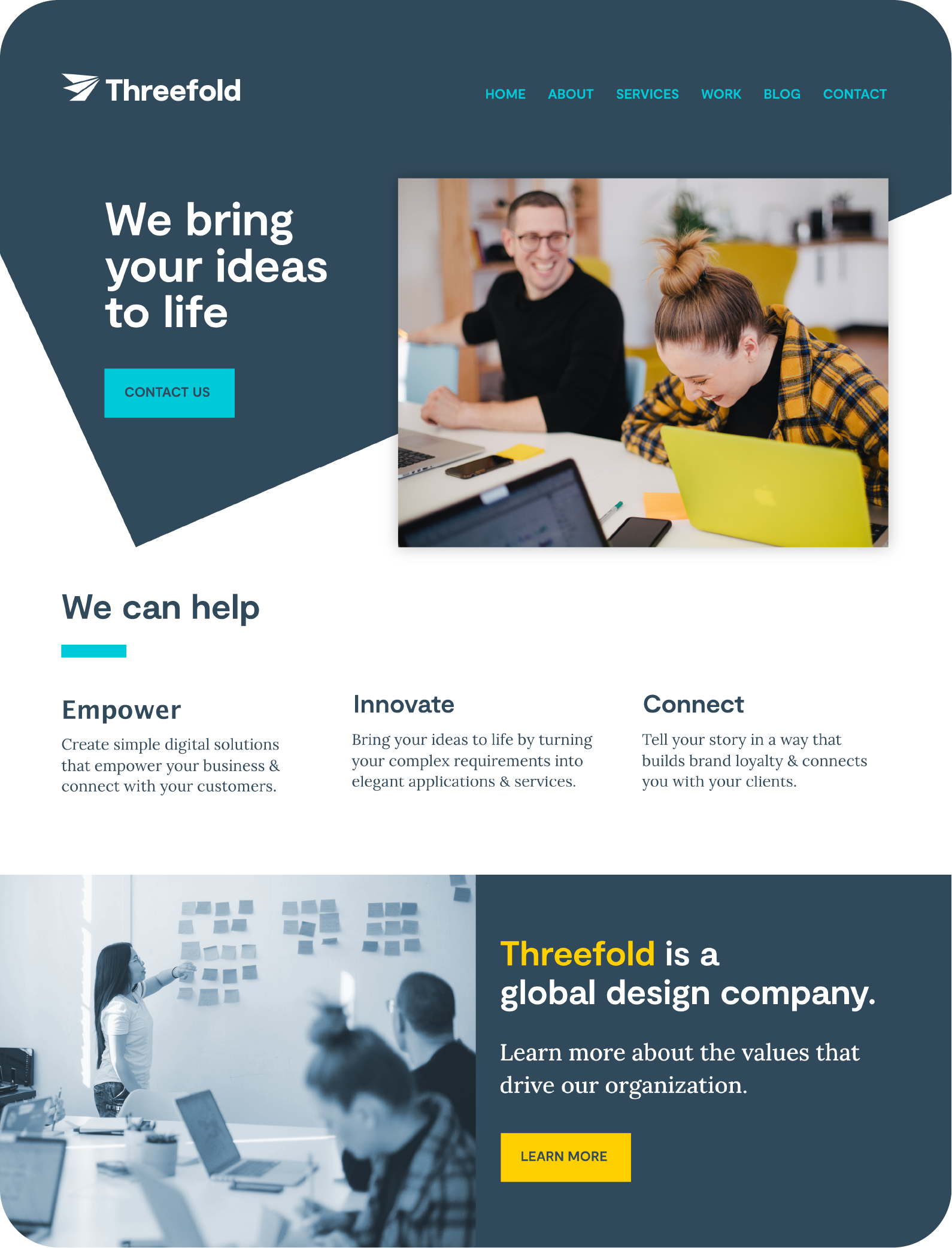
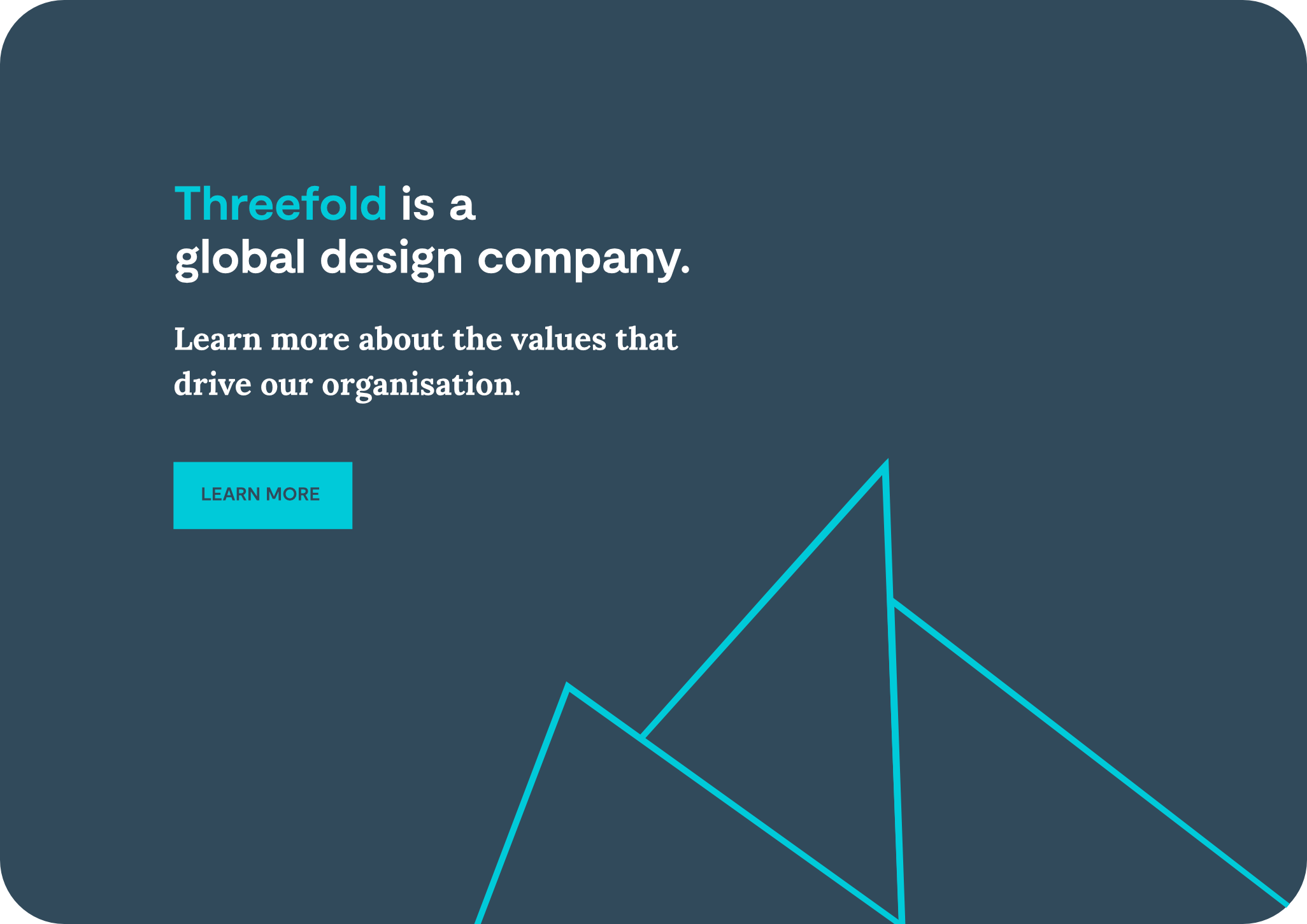
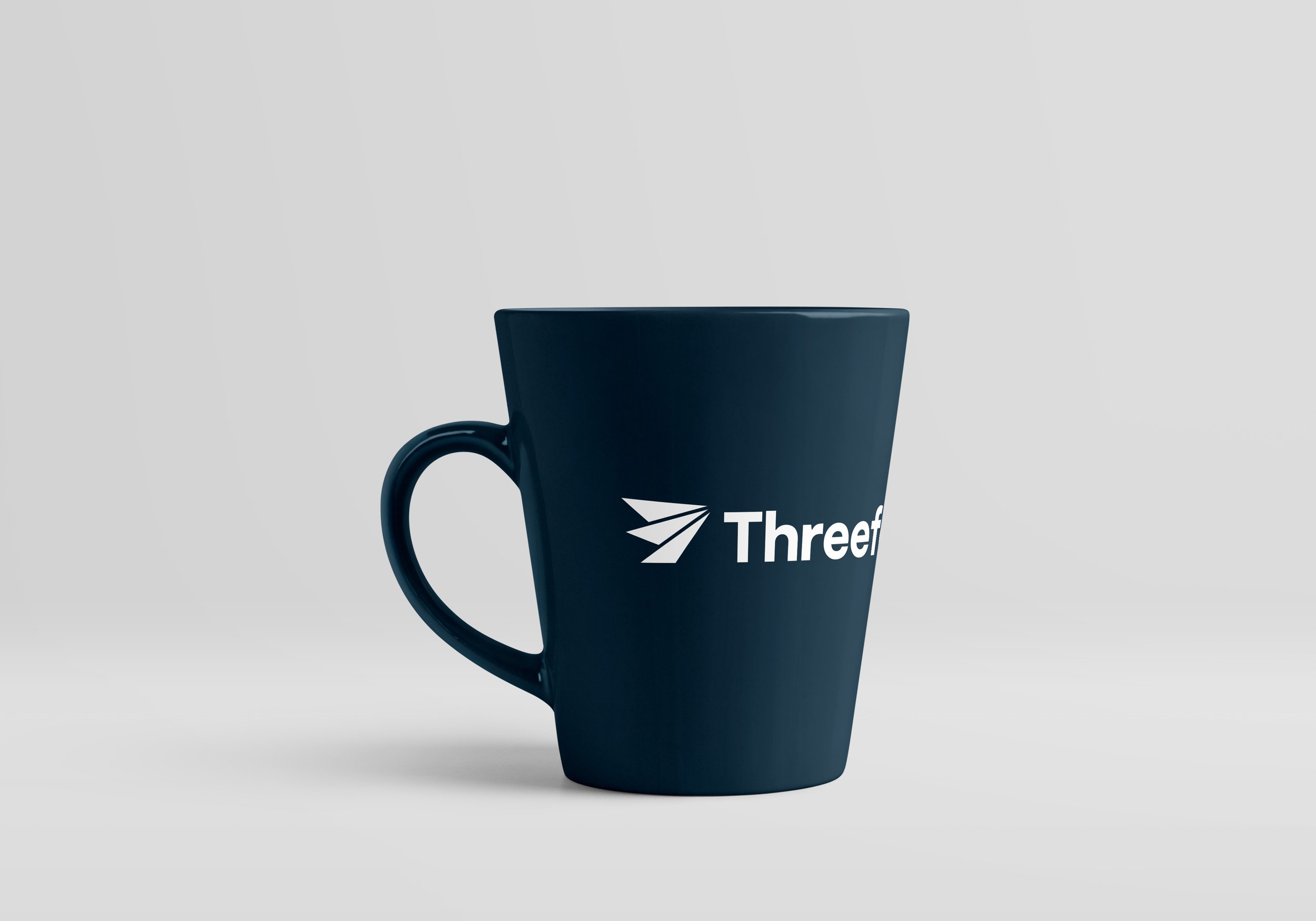
The logomark is the anchor point for all of these ideas. Three points coming together to create one dynamic, streamlined shape, the shape of an abstract paper aeroplane. The typography is a lovely geometric font family that sits well against the harsh lines of the paper plane. The colour scheme is clean, bright and welcoming with accents of yellow for warmth and turquoise for space and lightness.
Shane Doyle, Project Lead at Threefold says:
‘We worked with Liz on the rebrand of our company. In particular, we wanted her to help us define our visual identity so that it matched our culture and represented us. Working with her was a dream, she was fantastic and the whole team loved working with her. Plus the visual identity that she helped us define was perfect! If you get the chance to work with Liz, do. She is brilliant!’
Threefold now has a strong sense of identity that they can take forward with confidence into everything they do. They have a clear sense of self which enables them to expertly connect with new and previous clients as well as future employees.
They have a brand strategy that gives them a clear path into the future and makes communication easy and straightforward. Their current employees and stakeholders feel a strong affinity with the new brand and feel it truly reflects the amazing company they work for.
