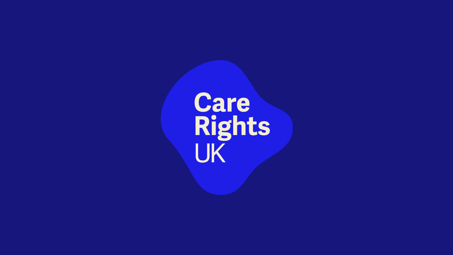

Hütte
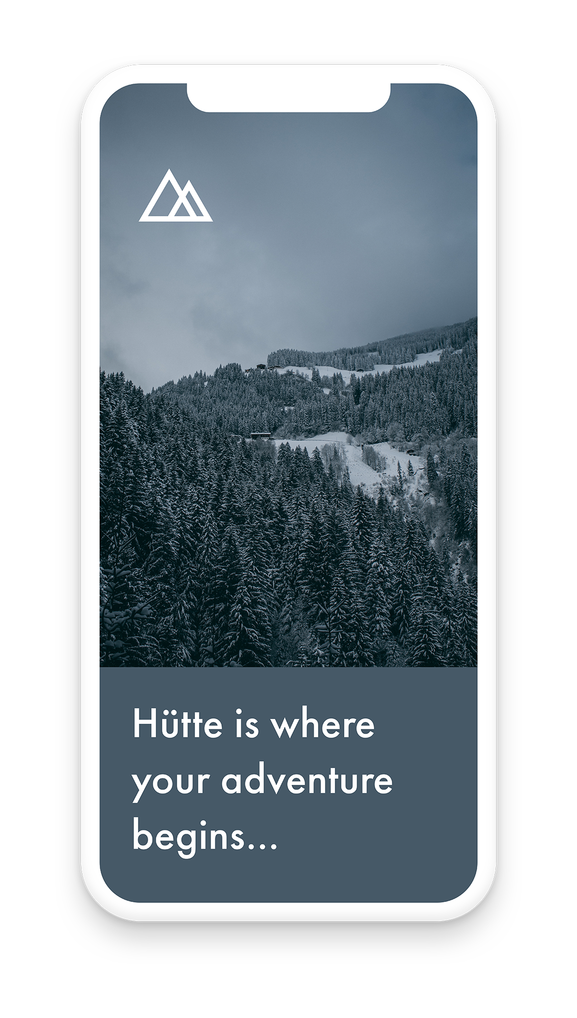
Hütte is a mountain travel company focusing on high quality accommodation, bespoke recommendations, local area expertise and minimal environmental impact.
My work
Brand creation including naming and digital design.
Visual Brand includes
Logo and logomark
Brand guidelines
Graphic devices
Colour
Typography
Imagery
Stationery
Digital design
Verbal Brand includes
Naming
Tone of voice
Copy guidance


The challenge
Hütte needed to create differentiation in an industry where everything looked the same.
Hütte was called ChaletAway when I first met with founder Andrew Cameron, but after our first meeting it was very obvious that Andrew’s vision for the company was very different from other offerings in the sector.
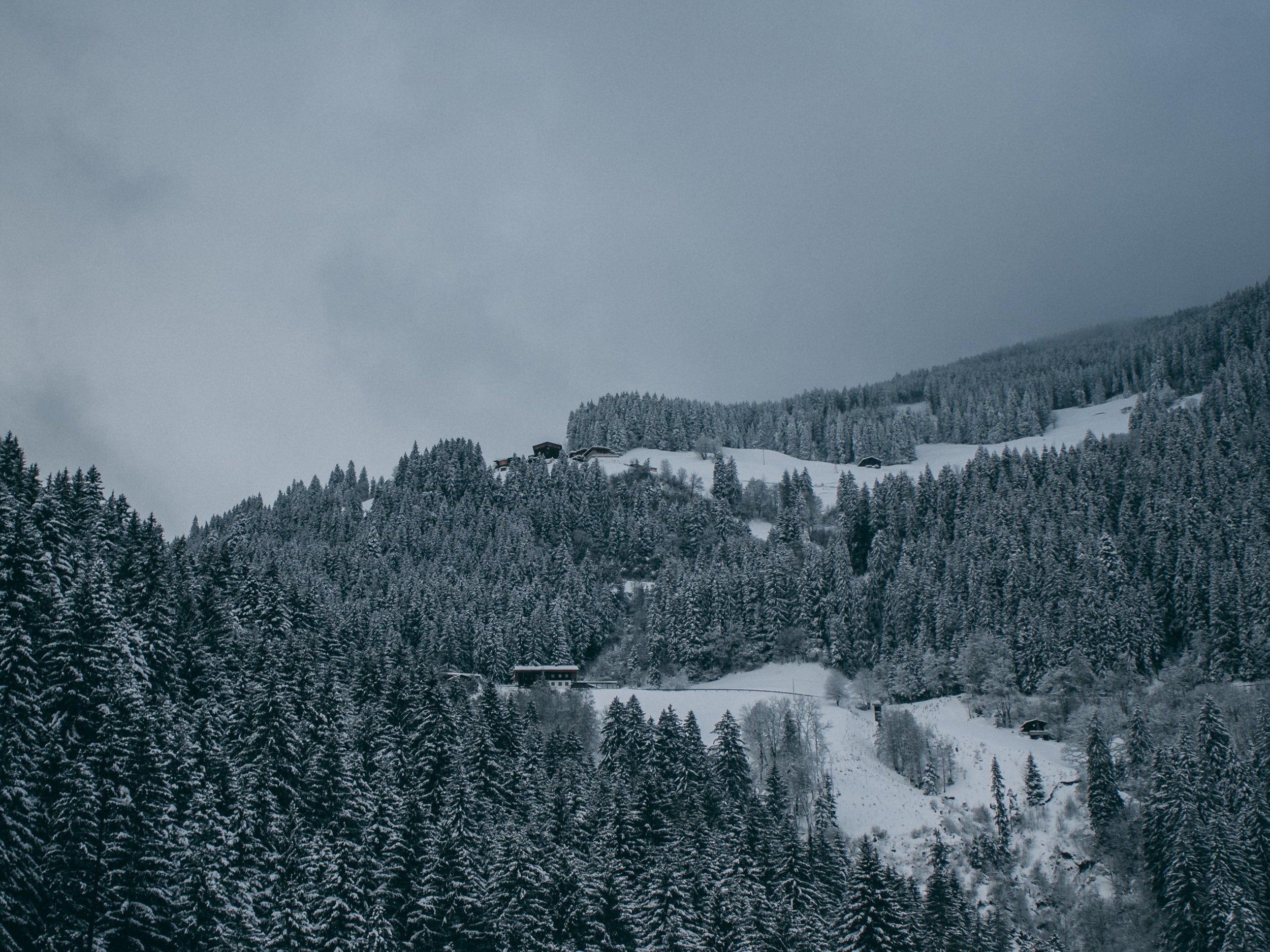
Firstly, Andrew wanted to provide quality over quantity with handpicked hosts and chalets. He uses local experts and guides to find the best places to eat, ski, hike, and unwind.
He is also hugely focussed on the environment with the end goal of the company being carbon neutral, but whilst the company moves towards that goal his aim is to have as little impact as possible on the environment both locally and globally.
Another key factor was Andrew’s focus on mental health and the benefits of the mountains as a year round place for people to escape to and unwind and how that can be made accessible and appealing to everyone.


My work
To explore and start to make sense of the various brand characteristics I started with an in-depth brand workshop.
I began by focusing on Hütte’s brand values, brand story, and brand personality by undertaking a number of exercises, I also streamlined their features and benefits, identified their communication objectives, identified their competitors and analysed their performance, analysed and understand their market focus.
This workshop together with further research and the design process led to the creation of a warm, outdoorsy, laidback, environmentally aware brand. Knowledgeable, yet fun it has a gentle positiveness at its heart.
It is visually distinctive from its competitors creating a feeling of quality and trust that reflects its values and mission.
The colour palette reflects the mountains throughout the seasons with a lovely pop of burnt orange that compliments both the grey blue and the grey green. The logomark reflects the chalets, the mountains and the safety of home. The illustrations are bespoke and use whitespace to signpost users to relevant sections of the website.

Andrew Cameron, owner of Hütte says:
‘Reflecting on our collaboration, it's clear that Liz’s approach to brand strategy and design is both professional and insightful. Her ability to adapt and build upon ideas, combined with her unparalleled attention to detail, sets Liz apart in her field.
Liz’s friendly demeanour, combined with her depth of knowledge, made our working relationship not only productive but also enjoyable. I have no hesitation in recommending Liz for future branding activities and believe any team would be fortunate to have her expertise at their disposal.’


Further projects