
Project Catalyst
Project Catalyst was a Care Network project helping to improve the confidence and resilience of people and communities during and after lockdown.
My work
Brand identity including guidelines.
Visual Brand includes
Logo and logomark
Brand guidelines
Graphic devices
Colour
Typography
Imagery
Stationery


The challenge
As a short-term intervention Project Catalyst aimed to build supportive relationships in communities, encouraging resilience building moving forward.
Project Catalyst supports people who may have been shielding or who may be anxious about getting back out into their community, helping to boost their confidence and independence.
They also support the work of local community groups through guidance, support with governance, finding venues or helping with promotion, as well as funding for both new and existing groups, to assist with initial costs such as PPE, insurance or publicity.


My work
A key driver for the project was helping people feel empowered and supported.
Working closely with the amazing Care Network lead on the project we explored how we wanted the Project Catalyst brand to make the individuals and community groups they would be working with feel.
Key to this was resilience building in an environment that felt safe and supportive. It was important that individuals felt empowered to move forward even when they were still feeling vulnerable. That they would be held by their local support groups and workers.
Equally as important was that these groups felt acknowledged and supported too with the vital work and services they were providing.

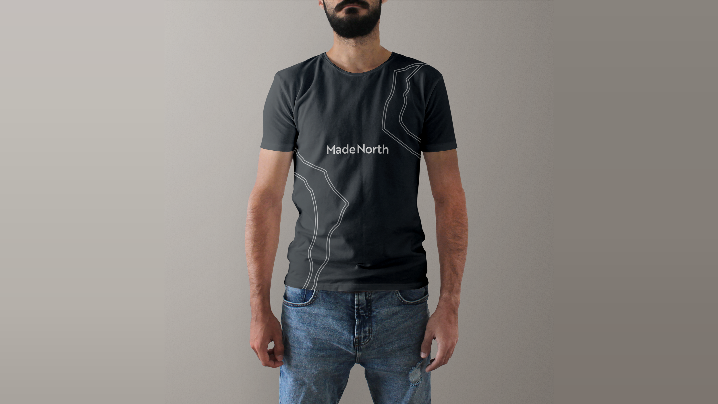
The final visual identity feels energetic and optimistic with a sense of forward momentum and strength. Its easily identifiable on clothing creating a feeling of safety and recognition.
The colour palette is simple and fresh conjuring up a sense of renewal and new beginnings. The typography is humanistic and accessible.
Further projects