SafetyLine
SafetyLine is a London Borough of Redbridge initiative to help address the significant challenge of domestic violence within the borough.
We partnered on
Umbrella brand including name, strategy and delivery.
Visual Brand includes
Logo
Brand guidelines
Illustrations
Graphic devices
Colour
Typography
Squarespace design
Refuse truck wrapping
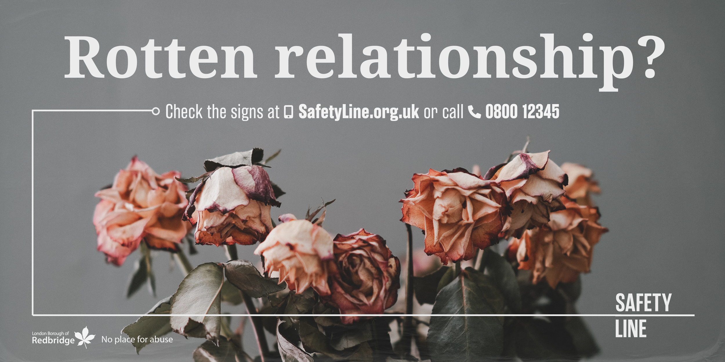
Billboard design
Verbal Brand includes
Naming
Comms
Our team

Elizabeth Elcoate - Creative Director, Brand Strategist, Designer

Mike Williams from Civic - Project Lead, Brand Strategist, Writer
The challenge
SafetyLine is an umbrella brand communicating to multiple audiences across multiple channels through a single front door.
Over a 3 - 5 year intervention framework London Borough of Redbridge hopes to address the significant challenges it faces due to the high levels of domestic violence in the borough. The initiative will grow to have multiple campaign hits to cover a wide range of issues and audiences
The audiences primarily include victims, perpetrators, and bystanders but will also include politicians, community leaders, and professionals.
The initial aim is to help women find a place of safety by contacting the safety line and to help them spot the signs of an abusive relationship. Future campaigns will also connect with perpetrators to assist with behaviour change, as well as bystanders such as friends and family to help them spot the signs of domestic violence.

Our work
We worked closely with the team at Social Engine to create a brand that was able to grow and adapt over the next few years.
The name SafetyLine communicates the simple key idea that there is a helpline that will help you find safety. It also represents a lifeline being thrown when you need it most. The simple logo and graphic devices represent this.
The brand is flexible. The main brand colours are a powdery purple and a bright and energetic turquoise. These colours are used on the website, on stationery and reports. However, when used on campaign billboards and refuse truck wraps the brand will mainly be used in white to let the imagery do much of the communicating.


It was essential for the core SafetyLine brand to be strong and recognisable and the central core message easily accessed whilst allowing for a level of flexibility across the various campaigns - allowing for key elements such as imagery style, messaging, colours and at times typography to change.
The brand has room to grow and expand over the lifetime of the initiative with plans for physical installations as well as film work to be used to challenge and combat this very serious problem.

Wheelie bin tags

Further projects